I'm a product designer currently working on AI-native systems, including LLM classification, agent workflows, and automation tools that help scale human decision-making. I enjoy high-ambiguity environments and turning unclear goals into usable systems. My focus is building simple, scalable systems that connect users, product thinking, and technical constraints.
What I've been working on
Work Domains // depth lives one layer down
Domain 01
Intelligent Products
AI, trust, and guided system behavior for products that need to feel smart while being transparent.
AI frameworksEmbeddingsRecommendation EnginesAgentic HITL Workflows
Domain 02
Consumer + Community
More human-facing work where identity, discovery, and engagement matter as much as structure and utility.
Community BuildingChat SystemsContent StrategyConsumer Product Design
Domain 03
Enterprise + Transformation
Data-heavy workflows, platform redesigns, and design leadership work that improves both product quality and team maturity.
System DesignData AnalysisPlatform StrategyDesign Systems
Selected Use Cases
Last Update // 4.2026
Consumer and Community
LaserMark DB
Created a community-driven database that helps makers discover, validate, and share reliable laser settings across materials and machines.
Consumer•Community•Discovery
Personal product + systems thinking
LaserMark DB
Creating a trusted community-driven settings and verification layer for real laser workflows
LaserMark DB is the trusted community-driven settings and verification layer for laser workflows. In plain language, it helps people answer a question that usually sits behind trial and error, wasted stock, and scattered notes: What is a credible starting point for this machine, this material, and this result?
I created LaserMark DB as a self-directed product, which meant I owned the design, product definition, requirements gathering, and prototype/build decisions. The product is functional and shipped. The core scope includes machine-aware settings search, settings detail pages, verification with photo evidence, project repositories, Q&A, moderation, and export support.
Solo ownershipdesign, requirements, and prototype/build
3 core trust layerscontext, verification, and safety
1 key workflow betreduce setup friction with material prefill
This was a self-directed product project. I owned the research framing, product definition, UX, requirements gathering, information architecture, feature prioritization, and prototype/build. I also drew from direct experience as a user of both fiber and CO2 lasers, which helped me recognize where laser workflows break down in practice, not just in theory.
Product design
Defined the interaction model for settings discovery, evaluation, verification, and moderation.
Product definition
Shaped feature scope, workflow priorities, and the behavioral rules behind trust, evidence, and review.
Prototype and build
Used lightweight development to test ideas directly and tighten the product requirements as the workflows took shape.
Because it was a solo project, this case study is a good example of how I work when I need to move from ambiguity to a concrete product direction quickly. In my collaborative enterprise work, the same strengths show up differently through alignment, tradeoffs, and cross-functional execution.
The problem was finding settings and knowing whether to trust them.
Laser workflows are sensitive to machine type, lens setup, material composition, thickness, finish, and intended result. The product requirements describe this as a trust, waste, and safety problem: people deal with conflicting advice, scattered project files, outdated manuals, and repeated trial and error.
That matters because laser work is physical. A bad recommendation can waste expensive material, cost shop time, and create safety issues when people work with unfamiliar substrates or bad assumptions.
Scattered knowledge
Users piece together settings from social groups, software forums, support docs, and personal notes.
Weak transferability
A setting that worked once may not translate cleanly across a different machine, material finish, or lens setup.
High cost of being wrong
Trial and error is expensive when the output is physical and the material may be hard to replace.
Research, synthesis, and domain context
I used a mix of community research and direct domain experience to shape the product. That included Facebook chat interviews and group discussions, laser manufacturer support boards, Reddit discussions, laser software support forums, and my own experience using fiber and CO2 lasers.
To move through that volume of input efficiently, I used AI as a synthesis tool, not as a decision-maker. It helped me organize notes, cluster repeated pain points, bubble up correlations across sources, and draft hypotheses worth reviewing. I treated those outputs as prompts, not conclusions. I was responsible for deciding what was credible, what needed validation, and how those patterns should influence the product.
Why my direct use mattered
Hands-on experience with fiber and CO2 lasers helped me separate plausible-looking advice from settings that were actually usable in a shop workflow.
Why AI helped
It made it easier to manage noisy, unstructured research notes and keep the emerging product direction focused without treating generated summaries as truth.
Patterns that shaped the design
A few themes kept recurring across community research, software support discussions, manufacturer support content, and my own laser use. AI was useful for clustering these signals and exposing how often they co-occurred. The design work was deciding what those patterns meant and how the product should respond.
1. Context drives trust
Users could often find settings, but not enough context to know whether those settings applied to their exact machine, material, finish, or intended result. That led me to treat trust as a workflow problem.
2. Setup friction was too high
People were copying product details by hand from disconnected resources, guessing which fields mattered, and normalizing inconsistent parameters manually. That pattern directly led to the material prefill feature.
3. Merchant data is messy
Variant URLs, product names, and material descriptions were often inconsistent. That drove the need for canonicalization, raw-plus-normalized values, confidence, and warning states instead of silent guesses.
4. Safety uncertainty is real
Users wanted fast answers, but some materials and settings require caution. That pushed me toward reviewable outputs, visible warnings, and nulls when the evidence was weak.
5. Reuse depends on structure
People did not only need answers. They needed a way to compare past jobs, reuse successful setups, and understand what changed. That influenced the data model and the decision to keep machine, material, result, and evidence connected.
6. Community knowledge needed stronger signals
Forums and groups were useful for language and pain points, but weak for accountability. That reinforced the importance of verification, attribution, version history, and moderation in the product.
The workflow strategy
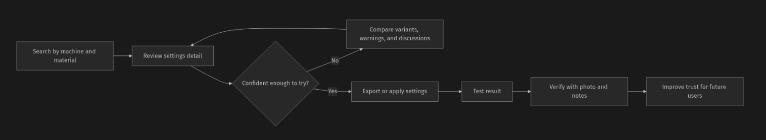
From a product standpoint, I wanted LaserMark DB to do two things at once: reduce friction in everyday setup and make uncertainty more visible instead of hiding it. That led to a workflow strategy built around searchability, reviewable context, evidence-backed verification, and careful handling of ambiguity.
Find
Search by machine, material, or keyword, then narrow with filters and visible trust cues.
Evaluate
Review parameters, author context, verification counts, warnings, and linked discussions before applying a setting.
Apply
Export settings to the tools people already use, including LightBurn-compatible formats and standard data exports.
Verify
Turn a one-time result into reusable community knowledge through photos, notes, and visible validation.
Refine
Keep version history and discussion attached so the database can improve instead of freezing bad assumptions in place.
Govern
Support warnings, review, and moderation where the risks are too high for passive publishing.
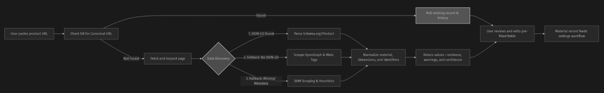
Featured workflow: material prefill from product URLs
One part of the product I am particularly proud of is the ability to pre-fill material information from a product URL. This came directly from a repeated friction point in the research and from my own experience: too much time was being spent copying details from supplier pages into a settings workflow before any actual testing could begin.
The design challenge was using extraction or scraping technology responsibly and not pretending the system knows more than it does.
What it does
A user pastes a public product URL and LaserMark DB attempts to pre-populate core product and material fields such as image, product name, description, dimensions, material family, and related attributes.
Who it helps
It helps hobby users and shops reduce repetitive setup work, especially when they are testing new material sources or documenting a result for reuse.
Why it matters
It reduces manual entry without pretending the system knows more than it does. Review, evidence, and ambiguity remain visible parts of the experience.
Extraction prioritizes structured product markup first, then page metadata, visible page content, URL signals, and site-specific adapter rules. It returns normalized values and raw source values, field-level evidence, warnings, and confidence rather than collapsing everything into a single unreviewable answer.
The deeper product work was in the edge cases whwer emachine variants might not represent a meaningfully different machine. Material language is messy, especially when commercial names, substrate families, finishes, and sizes are mixed together. The spec handles this with canonicalization rules, variant retention rules, a layered material taxonomy, and explicit warning conditions when the evidence is weak or conflicting.
Design principle
Unknown values should stay unknown. Nulls are better than confident-looking guesses when the source data is weak.
Workflow principle
Pre-fill should speed up setup, but the user should still understand what came from the source page and what needs judgment before reuse.
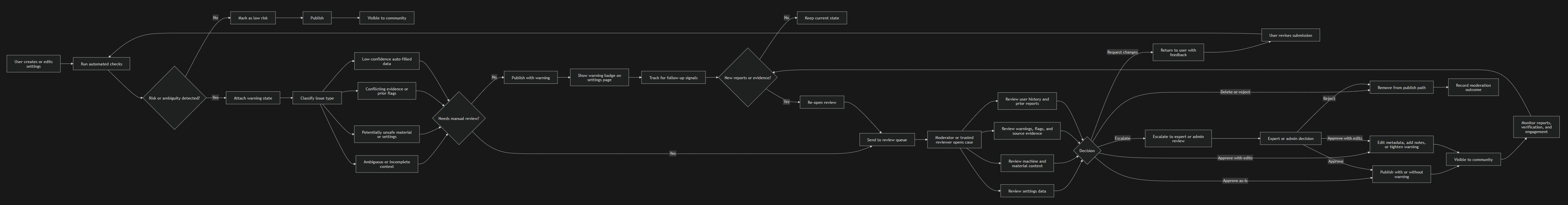
Verification turns a database into a trust system
The product requirements make verification a first-class workflow. Users can test a settings sheet, upload photo evidence, rate the outcome, and add context that strengthens the record for the next person. For shared knowledge to be useful long-term, the system has to make attaching and reading proof feel effortless.
Evidence
Photos and notes turn opinion into something more inspectable.
Attribution
Author identity, reputation, and version history help users evaluate not just the setting, but where it came from.
Feedback loop
Verification improves future confidence and helps the database evolve instead of remaining static.
What this case study Shows
The point of this project is not that I built a perfect end-state product alone. It is that I took a messy, credibility-sensitive workflow and gave it structure. I used direct domain experience, community research, product thinking, lightweight development, and responsible use of AI to move from ambiguity to a shipped system.
Systems thinking
I designed the product as a connected workflow, not a stack of isolated screens.
Practical product judgment
I focused on reducing friction where it mattered while keeping provenance, review, and uncertainty visible.
Technology used responsibly
I used AI and lightweight development to move faster and stay organized, but the design, prioritization, validation, and final decisions were mine.
The product requirements and the extraction spec show the kind of work I enjoy most: systems with real constraints, real ambiguity, and a strong need for clarity and accountability.
Adaptive Insights
Adaptive Sheets
Redesigned a core planning workspace to unify three sheet models, preserve expert speed, and create a stronger foundation for the product.
Financial UX•System Design•Accessibility
Enterprise platform redesign
Adaptive Sheets
Rebuilding a core planning workspace so finance teams could stay in one system, work faster, and trust what they were seeing.
Adaptive InsightsLead Product DesignerEnterprise SaaS8 months to shipFinancial planning workflows
This was a platform redesign, not a visual cleanup
Adaptive Sheets was one of the most important features in the product. It's where planners and financial analysts spent their time building budgets, comparing periods, reviewing anomalies, and getting through close. But over time the experience had become inconsistent, harder to learn, and harder to trust.
Our goal was to rebuild the Sheets platform on a stronger foundation. The work unified standard, modeled, and cube sheets into one clearer interaction system while modernizing the product for HTML5 and JavaScript. I was the lead product designer on the program, so while the work was absolutely collaborative, I drove the interaction direction, the quality bar, and many of the product decisions that shaped what shipped.
8 monthsplanned as a longer program, shipped early
3 sheet typesstandard, modeled, and cube
~35%reduction in support calls
~25% avgfaster month close for large customers
We had to solve product pain and platform risk at the same time
The old experience had real usability issues. Actions were hidden in context menus, navigation changed from page to page, and similar tasks behaved differently depending on which sheet type you were in. That made the product slower to learn and more stressful to use during high attention work.
At the same time, the underlying technology was aging out. Cube sheets in particular depended on third-party technology tied to Java applets, and that foundation was being shut down. We couldn't keep layering fixes on top of it. We had to rebuild the product on a modern architecture while still supporting the people who depended on it every day.
Inconsistent experience
Actions, menus, and navigation patterns shifted too much across contexts.
Legacy foundation
Java applet dependency and other aging platform choices forced deeper rework.
Trust gap
Many planners still fell back to Excel because it felt faster, clearer, and more familiar.
Research changed the strategy, not just the screens
We went into the project with a few assumptions that didn't hold up. One of the biggest was that people mainly wanted to work in Excel and then move their data into planning. What we kept hearing was the opposite: people wanted to stay in one workspace because switching tools introduced friction, errors, and wasted time.
We also learned that formatting mattered, but not for decorative reasons. Users cared about structure, comparison, totals, decimals, and whether the sheet made sense under pressure. That shaped the redesign in a very practical way.
One workspace mattered
Users wanted to do more inside Sheets instead of bouncing to Excel or separate reports.
Formatting meant trust
Totals, variance, and layout cues helped users read and validate data quickly.
Comparison was a real need
Historical context inside the workflow helped users make better planning decisions.
Guidance beat guesswork
Drag and drop, filters, and parameters needed more visible cues to feel learnable.
Entry needed focus
Inline graphs were interesting, but they added noise in planning workflows.
Small details mattered
Things like double lines above totals and direct formatting were not cosmetic requests.
We weren't trying to make planning feel flashy. We were trying to make it feel dependable.
What I drove, and what we did as a team
This was a team effort, and I want the case study to reflect that. We had designers, doc writers, research support, product, engineering, QA, and an agency partner contributing to the program. My role was to lead the product design work and keep the system coherent as the work scaled.
What I drove
I led the interaction direction, look and feel, navigation, page taxonomy, branding decisions, and component behavior. I also worked directly with product and engineering leadership to turn research into the roadmap.
What we did together
Research planning, production, engineering implementation, documentation, QA, and rollout planning were collaborative. The final product is the result of that combined effort.
Where I pushed hardest
I pushed to make accessibility foundational, not a remediation project. I also partnered closely with engineering on the cube-sheet architecture and the tradeoffs needed to rebuild it the right way.
How I worked
I tried to keep the story honest, the decisions grounded in evidence, and the team aligned around what mattered most for users rather than what's easiest to explain in a review.
One product system had to support three very different models
The hardest design problem wasn't visual consistency by itself. It was creating one coherent experience across three different planning models that each had real differences in structure and behavior.
Standard sheet
Classic budgets, forecasts, and financial statements where people review or enter values across time and organizational levels.
Modeled sheet
Object-based planning for people, projects, assets, and contracts where each row behaves more like a business object.
Cube sheet
Multidimensional planning across things like product, customer, scenario, region, and time.
Our goal wasn't to flatten those differences. It was to make the shared parts feel familiar while letting the specialized parts show up only where the data model really demanded them.
The real design work was the interaction architecture
The most important thing we designed wasn't a single screen. It was a reusable interaction system for moving, editing, formatting, comparing, and understanding state across the platform. That's what made the redesign feel coherent instead of fragmented.
We standardized toolbars, menus, side panels, formula workflows, and core feedback states. That mattered because people using financial software do repetitive, high-attention work. If they have to keep reinterpreting the UI, they lose speed and confidence.
Predictable menus and states
Users no longer had to relearn where actions lived each time they changed context.
Shared editing patterns
Formatting, entry, save behavior, and state cues became much more consistent.
Expert speed preserved
We kept the product legible without sacrificing the muscle memory power users relied on.
We had to make real tradeoffs, especially around cube sheets
One of the most important parts of this story is that we didn't pretend we could do everything at once. Cube sheets were tied to third-party technology that was being shut down, so we needed to rebuild that experience on a new foundation. That meant making some hard calls about what to prioritize now and what to delay.
We communicated those tradeoffs directly to customers. We focused first on the things that most affected trust, efficiency, and long-term stability, even when that meant delaying lower-priority features or cosmetic requests.
Foundation over feature completeness
We chose to rebuild the cube-sheet architecture correctly instead of chasing parity with every legacy behavior right away.
Clarity over surface polish
We prioritized structural cues, formatting, and workflow trust over heavier theming and customization requests.
Focus over novelty
We moved inline graphs and other noisier ideas out of core entry workflows because they distracted from planning work.
Those choices weren't always easy, but they were intentional. They helped us deliver a product that was more stable, more scalable, and more honest about what it could support well.
Accessibility became part of the foundation
Accessibility wasn't something we wanted to patch after launch. We used the redesign as a chance to change the process itself. I pushed to make accessibility requirements part of components, branding, and interaction rules from the start.
Product impact
The product became easier to use for a wider range of people, especially in keyboard-heavy workflows.
Business impact
Accessibility improvements also helped in federal RFQ situations and strengthened the company's position with customers.
Process impact
Instead of treating accessibility as cleanup, we treated it as a standard for new work.
The work changed how the team operated too
This project wasn't only about the product, it alsochanged how we worked as a team. We got clearer about process, approvals, component documentation, and how design partnered with engineering and QA. Over time design moved from just-in-time work to operating roughly two sprints ahead.
Mentorship
I coached junior designers on documenting work for engineers, spotting accessibility gaps, and presenting ideas more effectively.
Better handoff
Shared rules and cleaner component thinking made implementation smoother and less ambiguous.
Quality rituals
We introduced stronger habits around usability, accessibility, and tech debt so quality became part of the process across the team.
What changed for customers, the team, and the business
The redesign shipped in 8 months and gave the product a stronger foundation to build on. Support burden dropped, close workflows got faster for large customers, and the team got more consistent about quality and delivery. The product also became more credible with customers who had been relying on Excel because they didn't trust the old experience enough.
100%of the redesign shipped in 8 months
35% support calls down
27%month close time down for large enterprises
2 sprints aheaddesign and development alignment improved
"You've made me a better father and husband. I don't have to stay late anymore and I get to spend more time with my wife and kids!"
That quote stayed with me because it captures what this project was really about. Not just a cleaner interface, but less stress, fewer late nights, and more confidence in the work. (No, I didn't make that up!)
Research signals that mattered
Practical insights and observations shaped the design decisions throughout the project.
Users built reports monthly, but ran them daily
That made day-to-day readability and speed much more important than one-time setup polish.
Excel remained the common output method
Direct formatting and familiar structure still felt easier to many users.
Double lines above totals mattered
Small structural cues carried meaning and couldn't be dismissed as visual preference.
Visual aids made drag and drop learnable
When the interface showed what would happen next, the interaction made sense much faster.
Filters and parameters were too hidden
People expected more direct, spreadsheet-like manipulation.
Themes were not the main request
Users cared much more about trustworthy formatting and workflow clarity than appearance controls.
Product Recall and Compliance
Recall Seeker
Designed a product safety experience that helps people quickly identify recalls, understand risk, and take the right next step with confidence.
AI•Trust•Product Design
Consumer product + search UX
RecallSeeker POC to V1
Turning recall intelligence into a more visual, actionable, and trustworthy product experience for consumers
Product designSearch UXResearch and testingHuman in the loopPOC to V1
A product for people who usually hear about recalls too late
RecallSeeker started with a simple but important challenge. Product recalls affect millions of consumers, yet most people do not actively monitor them. Public recall systems are often slow, text-heavy, and difficult to browse. Even when the data exists, the experience of finding a relevant product, understanding the risk, and taking action is harder than it should be.
This case study tracks how the product evolved from proof of concept to a stronger V1 direction. The work moved beyond proving that recall data could be surfaced. It became about trust, speed, and clarity. How do you help consumers identify the right product quickly, understand what matters, and feel confident enough to act?
90+% fasteraverage page-to-page performance vs CPSC browsing
60 to 80% fasterrecall identification in a 20-person visual A/B test
WCAG AAaccessibility treated as a product requirement
POC to V1driven by testing, research, and workflow refinements
My role
I used survey research, personas, process mapping, low-fidelity exploration, A/B testing, and working product screens to understand how consumers think about recalls and where trust breaks down. That informed both the consumer experience and the human-in-the-loop direction behind the product.
Research and framing
Developed surveys, interpreted behavior patterns, and translated findings into personas, journey maps, and product priorities.
UX evolution
Designed and compared dashboard, search, registration, and recall detail concepts across mockup, proof of concept, and V1 states.
Trust and interaction
Explored how AI-assisted recall workflows could stay transparent by using approvals, verification steps, and better communication patterns.
What I enjoy most about work like this is that it connects product strategy to interface decisions. The page layout only gets better once you understand what users are worried about, what they are missing, and what they need in order to act.
The problem was not only awareness. It was trust, speed, and action.
Consumers and organizations face millions of recalls annually, but manual review is slow, error-prone, and difficult to scale. Public recall experiences often feel like research tools instead of action tools. People are expected to scan dense text, decode product names, and decide whether a recall is relevant with very little visual or contextual help.
That creates a UX problem as much as a data problem. Users do not trust automation without transparency, and they do not act quickly when the interface makes product identification feel uncertain.
Low awareness
Many consumers are passive and only learn about recalls by chance, long after a better notification or registration system could have helped.
Weak discoverability
Text-heavy search and inconsistent naming make it harder to match the recall to the real product in a consumer's home.
Low confidence
If the system does not clearly show what is affected and what to do next, users hesitate, ignore the issue, or postpone action.
Research made the opportunity much clearer
The research phase combined quantitative survey work with persona development, process flow mapping, and iterative testing. One of the clearest findings was that the majority of consumers were passive rather than proactive. They were not monitoring recalls regularly, they were not consistently registering products, and they were more likely to rely on chance exposure through news, social media, or store postings.
Awareness gap
49.6% of respondents were only somewhat aware of recalls and 25.6% were not aware, which showed a major gap between risk and attention.
Action gap
Only 37.2% had ever acted on a recall, which reinforced the need for clearer identification, stronger trust signals, and easier next steps.
Notification preference
Email emerged as the most preferred channel, which shaped how proactive communication should work inside the product.
That process work mattered because RecallSeeker was not merely a searchable database. It was trying to bridge registration, detection, communication, and remediation in a way that felt consumer-friendly while still respecting the complexity behind the scenes.
The product got better when it became more actionable and less abstract
The dashboard evolution tells the story clearly. The earliest mockup emphasized watchlists, overview metrics, and a brand safety monitor. Users appreciated the clean layout, but the surface did not support the real job they wanted to do, which was understanding whether they owned recalled products and what to do next.
The proof of concept and V1 shifted toward product registry, clearer status grouping, stronger default filters, tighter layouts, and a more explicit focus on products with recalls. That was the turning point. The dashboard stopped being a passive overview and started acting more like a control center.
Default to urgency
Products with recalls deserved stronger visual priority than safe products or generic monitoring metrics.
Reduce noise
Mixed views of safe and recalled products diluted attention and made it harder to see what needed action.
Support peace of mind
Users wanted a real-time check now capability, not just nightly matching, because trust is partly about immediacy.
Search became a product differentiator
One of the strongest improvements in the product was the move from text-heavy recall browsing to a more visual and intent-aware search experience. Users cared more about recognizing a product than reading a reference number. That meant image-forward cards, clearer titles, simpler actions, and less cognitive load.
Under the surface, the search model improved too. Traditional keyword and contains searches were weak for real consumer behavior because people do not always know the exact product name. Semantic search performed far better. In the deck example, searching for Elmo Nightlight returned the correct recall first, while a comparable public search experience buried the answer several pages deep and loaded more slowly.
Visual recognition
Images, mini carousels, and stronger card layouts helped users identify relevant products faster than text-only results.
Semantic matching
Intent-aware search handled naming differences and misspellings better than exact keyword logic.
Consistent actions
Unified action bars for sharing, bookmarking, and quick access reduced decision friction while scanning results.
Recall detail needed to be readable, trustworthy, and accessible
The detail page was another place where the product had to do more than mirror existing public systems. Users needed the right information surfaced upfront, with stronger grouping, better imagery, clearer contact information, and better accessibility support. The design aimed to answer the practical questions first: what product is affected, why does it matter, and what should I do now?
Accessibility was treated as part of the feature, not an afterthought. The detail experience included keyboard navigation support, accessible image handling, and stronger control around components like lightboxes so users stayed oriented during interaction.
Human in the loop design helped reinforce trust
As the product evolved, trust in agent-driven recall processing became a visible concern. Users were interested in proactive messaging, but they also wanted reassurance that important steps could be verified, corrected, or unblocked when needed. That led to stronger thinking around SMS and email notifications with actionable calls to action, along with clearer verification steps around product registration, address confirmation, and resolution status.
Explain the status
Users wanted recall status and blockers surfaced closer to the product card, not buried in a separate management flow.
Confirm gated steps
Verification moments like confirming address, product details, or remediation status improved confidence in the automation.
Escalate when needed
If a workflow required human review, the system needed a clear path for admins or agents to verify and unblock the case.
This is where the product becomes more interesting than a search interface. It starts to behave like a service layer that helps consumers and operators work together to resolve a safety issue cleanly.
What happened
The product direction became more visual, more accessible, and more action-oriented. The work translated complex regulatory data into something consumers could actually use. Search and navigation performance improved substantially, product identification got faster, and the experience became more inclusive and easier to trust.
Performance
Average page navigation performance improved by more than 90% compared with a public benchmark experience cited in the deck.
Recognition
Visual product cards improved recall identification speed by 60 to 80% in a small A/B test.
Accessibility
The product reached WCAG AA compliance while improving clarity, hierarchy, and richer metadata handling.
What this case study shows
This project shows how I like to work when a product sits at the intersection of messy data, consumer trust, and urgent decision-making. I start by understanding behavior and motivation, then I use structure, testing, and iteration to move the product toward the moments that matter most.
Research-backed design
I used surveys, personas, process maps, and testing to keep the product grounded in real behavior instead of assumptions.
Practical product judgment
I helped the experience move from informative to actionable by prioritizing recognition, clarity, and next-step confidence.
Systems awareness
I treated consumer UX and the supporting workflow as connected problems, especially once human-in-the-loop verification entered the picture.
At its best, RecallSeeker is not just a nicer way to read a recall. It is a better way to help people notice a problem, trust what they are seeing, and act before the risk gets ignored.
Product Safety and Compliance Platform
Recall Seeker
Designined agentic workflows with human-in-the-loop control to help recall admins triage, investigate, and respond to recalls with confidence and efficiency.
AI•Trust•Human-in-the-Loop•Product Design
AI systems + workflow strategy
RecallSeeker Agent System
Designing a bounded multi-agent recall process that keeps people in control while making the workflow faster, safer, and easier to scale
System designAgent architectureHuman in the loopCompliance workflowConcept strategy
A safer way to bring agents into a high-stakes workflow
Recall management is one of those problems that sounds administrative until you map the reality. Teams must detect a possible hazard, verify facts, coordinate regulatory requirements, notify customers, track remediation, and document everything cleanly enough to withstand audit. Most organizations still do that across fragmented tools, manual handoffs, and inconsistent documentation.
This concept for RecallSeeker reframed the problem as an orchestration challenge. Instead of treating AI as a black box that takes over the process, I designed a bounded multi-agent system that sits inside a clear workflow, uses tools to do focused work, and keeps human oversight where it matters most.
5 foundational rolesdetect, validate, comms, resolve, and audit
2 tool layerstask-specific tools plus shared system tools
Level 1 autonomyAI recommends, people approve
Audit-first designtraceability built into every handoff
My role
This case study captures a systems and design exercise. I defined the operating model for how agents should participate in recall management, including the workflow boundaries, tool surfaces, event streams, autonomy levels, and the safety mechanisms needed to make the concept believable in a regulated environment.
Workflow strategy
Mapped the recall lifecycle from incident detection through closure and identified where bounded automation could remove manual coordination without taking control away from operators.
Agent definition
Created role boundaries, inputs, outputs, handoffs, and failure modes so each agent had a narrow job and a clear reason to exist.
Safety model
Defined the testbed, autonomy levels, input limits, and approval posture needed to make the system explainable, measurable, and auditable.
In a system like this, the UX isn't just the interface, it's also the operating logic behind what the system is allowed to do, what it must explain, and when a human should stay in the loop.
The problem was coordination under scrutiny.
Current recall processes are slow because they combine multiple types of work that all carry different consequences. Detection, compliance, communication, product recovery, and closure each have their own rules, stakeholders, partners, and evidence requirements. When those steps live in disconnected systems, the recall becomes harder to move, monitor, and trust.
That is a recipe for disaster in automation. If an AI system enters a workflow like this without boundaries, explainability, and logs, it doesn't reduce risk. It creates a new category of it.
Fragmented operations
Teams coordinate intake, compliance, customer outreach, and remediation across separate workflows that do not naturally stay in sync.
High cost of error
Mistakes in messaging, regulatory reporting, or product recovery can create legal, operational, and safety consequences.
Weak visibility
Without a shared system of record, it is difficult to know what happened, what is blocked, and whether closure requirements are truly complete.
The strategy was to anchor intelligence to a stable baseline workflow
One of the most important decisions in the concept was to start with a baseline system that already solved the core recall pipeline. Incident intake, regulatory workflow, customer notification, product recovery tracking, and audit logging all had to stand on their own first. Agents were then layered on top to guide, recommend, draft, validate, and coordinate, rather than replace the foundation.
Baseline first
The workflow remains functional even without agents, which lowers implementation risk and prevents the architecture from becoming AI-dependent.
Bounded roles
Each agent owns a narrow phase of the process, which reduces overlap, makes handoffs easier to understand, and limits where a failure can spread.
Shared tools
Agents act through tools with defined actions and states. That makes the platform easier to extend later without redesigning the whole system.
This is also why the system feels more practical than a typical agent diagram. The point was to show how a real business process could adopt intelligence without giving up accountability.
How the architecture works
The orchestration model follows the actual progression of a recall. A detection layer monitors inbound signals and structures a potential incident. Verification checks risk and output quality. Communication handles outreach and acknowledgements. Recovery coordinates returns, replacements, or destruction. Audit keeps the entire chain visible and reportable.
That sequence is supported by both task-specific tools and shared services like telemetry, orchestration, analytics, and a decision repository. The result is a system where agents can participate deeply in the work while still being legible to the people responsible for the outcome.
What I like about this structure is that it makes the handoffs explicit. Users don't need to understand the internals of an agent to trust the workflow. They need to know what stage they are in, what the system is recommending, and what must happen next.
Agent personas made the system more legible
Another useful layer in the concept was giving agents distinct identities and behavioral rules. Not because users need mascots, but because personified roles make specialization, handoff logic, and explainability easier to understand. A good agent persona says what the role is responsible for, what it will never do, and how it should behave when uncertainty appears.
Clear division of labor
Different voices and scopes reduce overlap between roles and make the operating model easier for users and internal teams to reason about.
Better explainability
Users can understand why a role acted because the persona is anchored to a recognizable specialty instead of a vague AI capability.
Stronger handoffs
When every role has a narrow purpose, it becomes clearer what should be passed forward, what should be rejected, and what should be escalated.
Boundaries of autonomy were part of the design, not an afterthought
Because recalls are high-stakes, I designed the system around bounded autonomy. The recommended operating mode was Level 1 autonomy, where AI can recommend actions, draft outputs, and flag risk, but a human still approves key steps. That creates room for automation without forcing the organization to trust an opaque system all at once.
Autonomy levels
Different parts of the workflow can tolerate different levels of automation, but hazardous or regulatory actions stay closer to human approval.
Input limits
The system should only act on approved data sources and structured evidence, not vague or unsupported claims that invite hallucination.
Decision space
Each role needs a clear line between what it may decide, what it may suggest, and what it must never do on its own.
That safety posture is what turns the architecture from a speculative diagram into something a real organization could evaluate seriously. The design asks them to trust a system with visible boundaries.
The testbed was how the concept became operationally credible
A multi-agent system like this can't be introduced responsibly without a place to test it. The testbed strategy created that place. Updates could be compared in a controlled environment, logs and metrics could be collected, and teams could decide whether a change should be promoted, iterated, or discarded before it touched production.
Why it matters
A safe experimentation layer reduces risk, speeds iteration, and creates evidence for what actually improves the workflow.
Why it fits the system
Because agent behavior is measured against outcomes, the organization gets a repeatable way to validate capability instead of arguing about confidence in the abstract.
What this case study shows
This project shows how I think about AI systems when the workflow matters more than the novelty. I am interested in where intelligence fits, what it should be allowed to do, how people stay in control, and how the system remains understandable when the stakes are real.
Systems thinking
I framed the work as an operating model with stages, evidence, and tool surfaces, not as a stack of disconnected screens.
Practical AI judgment
I used boundaries, approvals, and testability to make the concept safer and more believable than a generic agent narrative.
Workflow-first design
I anchored the architecture to the actual shape of recall work so the technology supports the process instead of competing with it.
For me, that is the most interesting part of agent design. Not what the model can do in isolation, but how the whole system behaves once people, rules, tools, and consequences are all part of the picture.
Enterprise Productivity
Workday Frontline Manager
Improved a complex time-tracking workflow to make scheduling, entry, and review faster, clearer, and easier for employees and managers.
Enterprise•Workflow Design•Product Design
Enterprise SaaS + systems thinking
Workday Frontline Manager
Designing a faster, more actionable time anomalies workflow for frontline managers
Product designWorkflow redesignCross-platformTime and AttendanceReleased
A product for managers who did not have time to be managers
Time Anomalies was part of the broader Frontline Manager Experience program at Workday. The goal was simple to say, but difficult to solve well: help frontline managers spend less time chasing time sheet errors, approvals, and attendance exceptions so they could spend more time on the floor leading their teams.
I led design for this feature area end to end, while also helping shape the surrounding workflow, integration points, and mobile support. The work grew beyond a single dashboard. It became a connected time management experience that surfaced what needed attention, automated the easy path, and reduced the manual overhead of correcting exceptions one worker at a time.
Feature leadend to end across web, with mobile partnership
100% EA adoptionall EA partners renewed after release
Up to 100% efficiency gainfor zero-error bulk processing through automation
Scaled beyond retailexpanded into hospitality and food service
My role
I was the design lead for the feature, working across product areas and across platforms. Beyond designing screens, I helped define how the overall experience should hang together, where the integration points lived, and where automation could remove work from already overloaded managers.
Experience strategy
Developed the day-in-the-life framing for frontline managers and used it to identify where time management belonged in their actual day.
Workflow design
Defined the anomaly detection, review, approval, and exception-handling flows across web, while supporting direction for the mobile designer.
Cross-product integration
Mapped integration points across Time and Attendance, Scheduling, Payroll, HR, Reporting, and planning-related products so the feature did not become another silo.
This project is a good example of how I like to work in enterprise environments. I don't just design the page in front of me. I try to understand the operating context, the surrounding systems, and the moments where the product can either save time or create friction.
The problem was not missing data. It was too much manual effort around it.
Frontline managers were spending too much time finding and correcting time sheet errors, handling approvals, and chasing down missing or mismatched entries. Many were working weekends and overtime just to stay on top of vacation requests, attestation approvals, and time corrections.
That was a serious workflow problem because frontline managers are supposed to be on the floor. When they are trapped in the back office doing repetitive time administration, the product is taking them away from the part of the job that matters most.
Too much navigation
Managers often had to move employee by employee just to review, correct, and submit time.
Too little visibility
Critical attendance and approval signals were hard to surface quickly, especially at the start of a shift.
Too much back-office work
Managers were doing administrative cleanup instead of spending time with workers and operations.
The day-in-the-life exercise became an important framing tool. It made it obvious that time management could not be designed as an isolated utility. It had to fit inside the first 60 minutes of a shift, support what happens on the floor, and still cover periodic responsibilities across operations, finance, and HR.
Research and framing
The program involved frontline managers, HR, time administrators, top customers and early adopters across retail, hospitality, food service, and manufacturing. What mattered most was not just what tasks existed, but how fragmented the manager's workday already was.
Research showed that managers wanted more actionable information earlier, especially during the first part of the day. They didn't need another passive dashboard. They needed a place that surfaced what was off, urgent, and what could be completed quickly without digging.
Users at the center
The feature was grounded in the lived reality of frontline managers who juggle operations, staffing, finance, and people tasks at once.
Integration mattered
No single team had a complete picture of how all of the connected product areas worked together, so part of the work was simply organizing those connections.
Design target
The experience had to reduce friction for the common case while still supporting more complex labor and compliance scenarios.
The strategy was to meet managers where their day actually starts
A few design principles kept the work focused. First, we needed to integrate into the Time Management Hub instead of creating yet another disconnected workflow. Second, we needed to bubble up actionable items and counts so managers could move immediately into work that mattered. Third, we needed to automate the easy path and reserve manual effort for true exceptions.
Start with urgency
Bring forward what needs attention in the first 60 minutes of the day, not after the manager has already gone hunting for it.
Design for scale
Managers with large teams need filtering, grouping, and batch actions. A one-worker-at-a-time flow does not scale.
Give autonomy back
Where appropriate, workers should be able to contribute to corrections themselves so the manager is not the bottleneck for every issue.
A connected set of tools, not a single dashboard
The final experience combined several features that worked together. The hub gave managers a clear entry point. The anomalies flow helped them identify and prioritize exceptions. Batch processing removed repetitive review work. Analytics pages gave them visibility into broader workforce patterns. Each piece had a specific job, but they all supported the same outcome: less time hunting, more time acting.
Hub
Show what needs review, what is urgent, and where the manager should go next.
Anomalies
Use visible counts and simple filters to move from awareness to action without repeated query setup.
Analytics
Support broader labor, attendance, productivity, and operations decisions from the same ecosystem.
One of the most important workflow decisions was batch processing. In the old model, managers could lose enormous amounts of time simply navigating through workers whose time sheets did not actually have problems. By separating low-friction approvals from true exceptions, we reduced wasted motion and let managers focus on what really needed attention.
Worker autonomy was part of the solution
Managers were carrying too much of the correction burden themselves. A better system needed to pull worker input closer to the source, whether that meant attestation, time-event capture, reminders, or a direct path for workers to correct issues without waiting for a manager to clean everything up later.
Fewer bottlenecks
Workers can provide information earlier, which reduces the manager's need to reconstruct what happened after the fact.
Better communication
Resolution becomes an interaction, not a one-sided administrative correction.
More accurate data
Capturing events closer to when they happen improves data quality and reduces cleanup work later.
Challenges and constraints
This was not a simple dashboard project. ML was still a new concept in the Time and Attendance space. Scheduling integration was being developed in parallel. Labor regulations varied by state and country, which made anomaly detection more complex. And because the work crossed so many product areas, identifying the right teams and validating the integration points took real effort.
Conceptual complexity
Anomaly detection sounds straightforward until labor rules, grace periods, exceptions, and regional differences enter the picture.
Organizational complexity
No one person had a complete map of all the connected systems, so part of the design work was building alignment across teams.
What happened
The feature delivered meaningful efficiency gains, especially for zero-error bulk processing when paired with automation rules. Every early adopter partner renewed once the feature was released. After GA, adoption and subscription growth continued steadily. Although it was originally built with retail in mind, the model expanded cleanly into hospitality and food service, with manufacturing customers showing interest as well.
Efficiency
Up to 100% improvement in efficiency for bulk processing zero-error time sheets when automated by rules.
Adoption
100% of EA partners renewed once released.
Scalability
The solution extended beyond its original retail focus into adjacent frontline-heavy industries.
What this case study shows
This project shows how I approach enterprise design problems that sit across multiple systems and multiple teams. I start by understanding the day that users are actually living through. Then I look for where the product is creating hidden overhead, where the easy path is missing, and where integration can remove work instead of adding more of it.
Systems thinking
I treated the experience as a connected workflow that spans dashboards, operational detail, exception handling, and worker input.
Practical product judgment
I focused on saving time where it mattered most, especially for managers dealing with large teams and repetitive approval work.
Enterprise collaboration
I helped define the integration points and the product shape across several related domains instead of designing in a silo.
For me, the best enterprise work is not just about making a cleaner interface. It's about helping people get back to the part of their job that creates real value. In this case, that meant giving frontline managers a faster, clearer, and more scalable way to manage time.
Contact
Open to the right conversations
Product design is my passion
Available for senior IC and lead roles where systems thinking, interaction depth, and design quality are the standard — not the exception. Enterprise SaaS, complex workflows, AI-assisted products.
Enterprise SaaSDesign systems0-to-1 products
Get in touch
Reach out via LinkedIn or Email. If you’re navigating high complexity and need a partner who can distill it into a clean, shippable reality... let's talk!.